Ever struggled to find information on a website? We wanted to ensure UM Interactive Media’s site is intuitive and user-friendly. Through an online open card sort, we explored how users naturally categorize and label information, directly informing a more user-centered site structure. In this case study, I’ll walk through our research process, highlighting the crucial user insights we gained, and explain the actionable recommendations we developed to significantly improve usability, ensuring users effortlessly navigate and access the information they seek.
Taking notes from lectures or meetings is time-consuming. Many struggle to find specific moments in long recordings. Can AI solve this?
Why it matters: We want to learn how users naturally group and label information on the UM Interactive Media website to identify patterns in their mental models and improve navigation.
Why it matters: Understanding where users struggle to find information will help us pinpoint areas where the site's information architecture needs improvement.
Why it matters: We want to determine the terminology and categorization methods that make the most sense to users, ensuring the website aligns with their expectations and enhances usability.
In my role as Lead Designer, I managed both the design process and project timelines, aligning the website's visual and functional aspects with study findings.
3
2 weeks

UX/UI Designer
My contributions extended to UX research, where I conducted participant interviews. These insights were instrumental in shaping design decisions and resolving key user pain points, all while adhering to project deadlines and milestones.

 Introduction & Consent
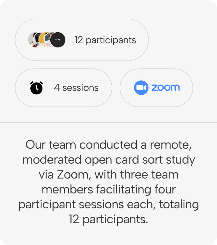
Before each session, participants received a detailed explanation of the study’s purpose and procedures. Informed consent was obtained, and explicit permission was granted to record the Zoom sessions for analysis.
Pre-Sort QuestionnaireParticipants completed a 10-question demographic survey before the card sorting exercise. This provided contextual information to analyze potential correlations between participant backgrounds and sorting behavior.
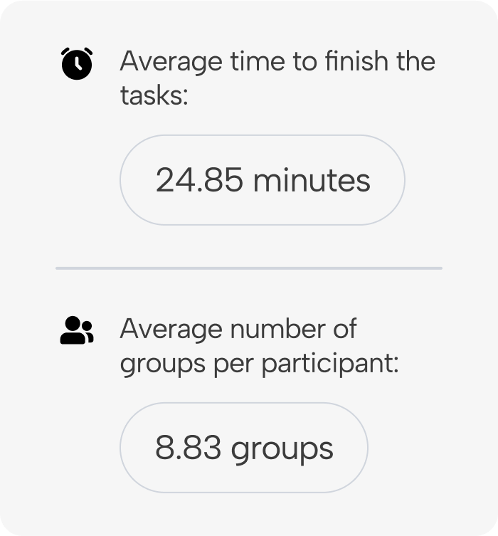
Card Sorting TaskParticipants used OptimalSort to categorize website-related items based on their intuitive navigation preferences. Moderators encouraged participants to verbalize their thought processes while minimizing interruptions. During the task, participants were asked to:
After completing the sorting exercise, participants:
All sessions were conducted remotely using Zoom and OptimalSort. Participants and moderators used personal computers with internet access. Each moderator facilitated four sessions, ensured the study was conducted properly, and documented participant insights.
Our pre-sort questionnaire helped us understand our participants' backgrounds, ensuring we captured a range of perspectives to inform our findings. We collected basic demographic details such as age, gender, and ethnicity to identify potential patterns in how different users organize information. Additionally, we gathered insights into their familiarity with technology and UM Interactive Media website to assess how their experience level might influence their sorting decisions. These responses provided valuable context for analyzing the card sort results, allowing us to draw deeper conclusions about user navigation preferences for the UM Interactive Media website.


Participants were recruited using convenience sampling, allowing us to efficiently gather a diverse range of perspectives and initial insights into user needs and preferences. However, future research with a larger and more representative sample will be necessary to validate these findings.
Participants:We interviewed 12 participants, all existing or prospective college students over the age of 18. While the sample size was relatively small, it provided a valuable foundation for identifying key themes and informing the design of the UM Interactive Media website.


Our research revealed that participants were generally unlikely to recommend the current UM Interactive Media website, reflected in a Net Promoter Score (NPS) of -33.
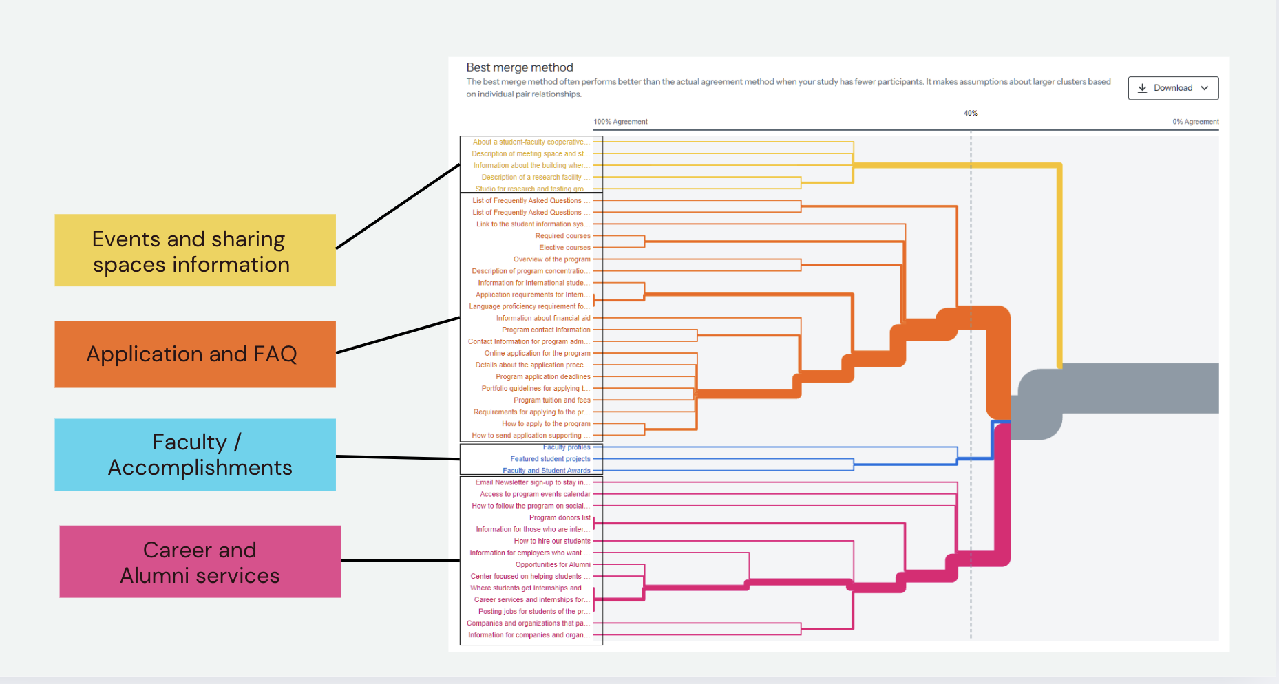
We considered a 40% agreement level as the threshold for identifying meaningful groupings. At this level, four distinct groups emerged, indicating that participants primarily organized content by function rather than audience:
Our analysis of the similarity matrix highlighted consistent patterns in how participants associated content:
Items like "Career services and internships for students" and "Posting jobs for students of the program" showed a high similarity score, indicating that participants consistently associated career services and job-related content as part of the same category.
Application requirements for international students" and "Information for international students applying to the program" were frequently paired, reflecting a strong user expectation that information related to international applications should be grouped together.
"Description of Meeting Spaces" and "Information about the building where classes are taught" had a high similarity score, suggesting that participants expected information about facilities and campus logistics to be presented together.
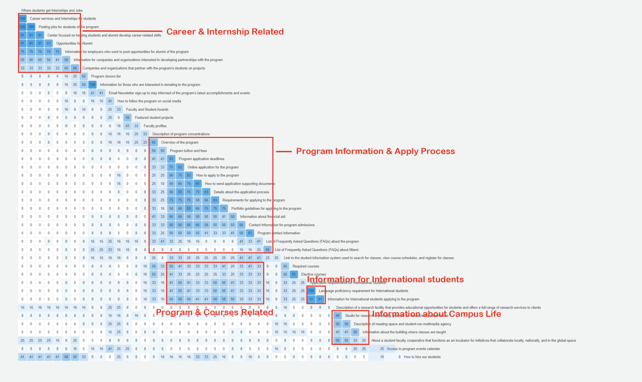
Our analysis revealed six clear content clusters, reflecting user expectations:

The findings from our card sorting exercise provided valuable insights that directly influenced our design recommendations. Due to project limitations, we were unable to develop a fully interactive website. However, leveraging the analysis, we were able to identify key secondary navigation patterns and make informed recommendations for a future build.
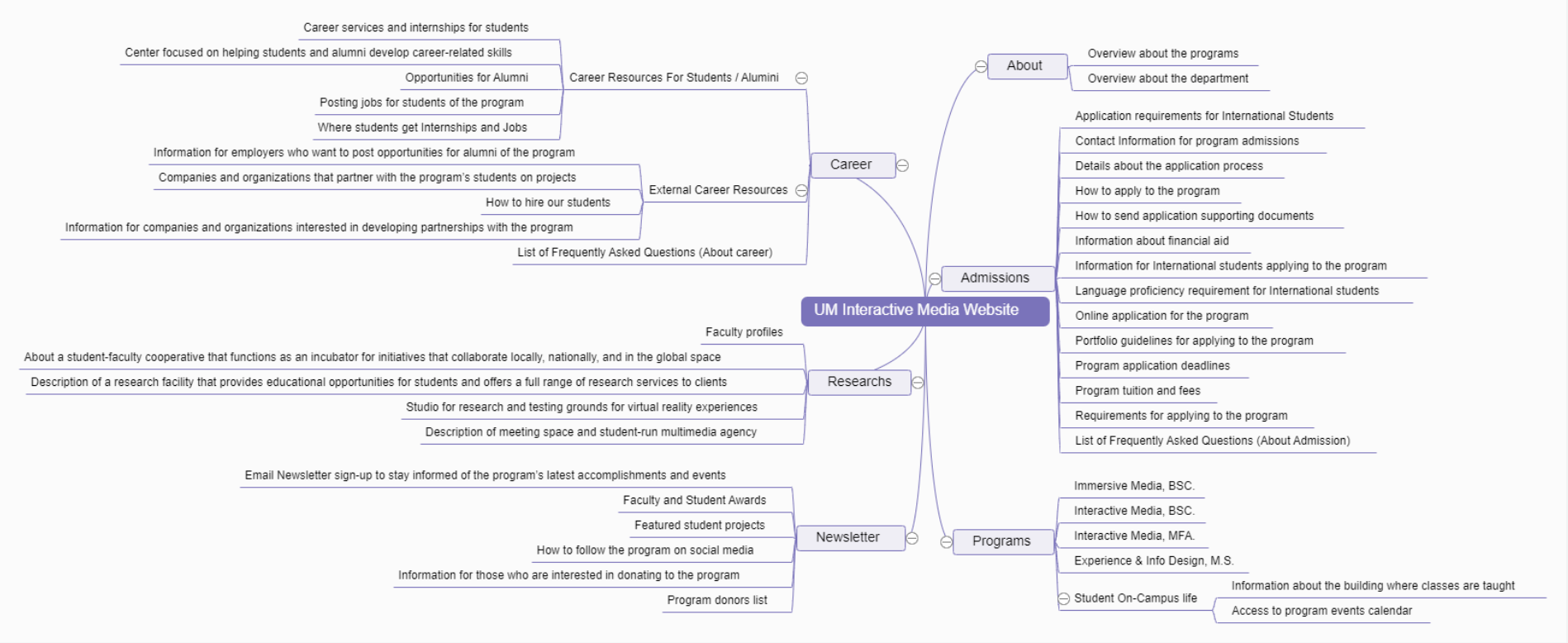

Conducting the study reshaped my approach to UX design by revealing how users naturally structure information. It pushed me to rely on data rather than assumptions.
Seeing users group related concepts led me to create a "Career & Internships" section, improving navigation and accessibility for career resources.
This experience reinforced the need to design in line with users’ mental models, ensuring information is presented intuitively for better usability and satisfaction.